Make your Website Responsive in Just 13 Minutes

In website development, it is essential to make sure that
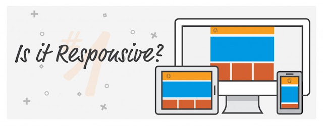
your website is responsive. In other words, your website must be able to adjust
itself to the size of the screen display. In order to do this, you need to have
a basic knowledge of HTML5 and CSS.
This article will tell you the step by step process for
making a website responsive. This tutorial is easy to follow since it is
crafted for the beginner level and will only take you about 13 minutes to finish.
Stage 1 - Preparation
In this tutorial, we will be using Foundation
for our framework because it is very easy to use.
Download a Foundation CSS package from
the internet. Once you finish, you will see a file named index.html included in
the package. We will be working from scratch, so you have to delete the file.
Then, open your preferred text editor and
save it as the new index.html.
Stage 2 – Coding
In your index.html file, copy the following
codes to your text editor.
<!-- paulirish.com/2008/conditional-stylesheets-vs-css-hacks-answer-neither/
-->
<!--[if lt IE 7]><html class="no-js lt-ie9 lt-ie8
lt-ie7" lang="en"> <![endif]-->
<!--[if IE 7]><html class="no-js lt-ie9 lt-ie8"
lang="en"> <![endif]-->
<!--[if IE 8]><html class="no-js lt-ie9"
lang="en"> <![endif]-->
<!--[if gt IE
8]><!--> <html class="no-js" lang="en">
<!--<![endif]-->
This code sets the viewport width to
device-width for mobile. After that, add the code found below:
<!-- Included CSS Files -->
<link rel="stylesheet" href="stylesheets/foundation.css">
<link rel="stylesheet"
href="stylesheets/app.css">
<!--[if lt IE 9]>
<link rel="stylesheet"
href="stylesheets/ie.css">
<![endif]-->
<script type="text/javascript"
src="javascripts/modernizr.foundation.js"></script>
<!-- IE Fix for HTML5 Tags -->
<!--[if lt IE 9]>
<script
src="http://html5shiv.googlecode.com/svn/trunk/html5.js"></script>
<![endif]-->
This code is for Internet Explorer configuration. It is
also where we determine the different stylesheets needed to make the website
responsive and run on mobile. Take note that the references and sources of your
stylesheets and scripts vary with the folder name.
Lastly, paste the following code after the previous. This for
the layout of your webpage. You can change the number of rows and columns depending
on what you want or on your client’s orders.
<div class="row">
<div class="twelve columns">
<h2>Header - Twelve Columns</h2>
</div>
</div>
<div class="row">
<div class="twelve columns">
<div class="row">
<div class="ten columns">
<h3>Body - Ten Columns</h3>
</div>
<div class="two columns">
<h3>Sidebar - Two Columns</h3>
</div>
</div>
</div>
</div>
<div class="row">
<div class="twelve columns">
<h2>Footer - Twelve Columns</h2>
</div>
</div>
Stage 3 – Testing and Review
Save the index.html file and open it with
your web browser. The page should show a header, body, sidebar and a footer.
Try to change the window or the size of screen display, you will notice the
page adjusts to the changes.
If it does not work, go back to stage 2
and review your codes.
Congratulations! You have created your very own responsive
website. It is now up to you how you would add images, texts or other media
contents in your website using your coding skills. Be creative and have fun!
Comments
Post a Comment